
Saturday, November 20, 2010
Tuesday, November 16, 2010
E-wallpaper tutorial Part 3 (Final)
Here's the part 3:
1) Open up the girl image.

Double click on the lock icon on the layer and then select ok when a pop up appear.
2) Use the pen tool to trace the body of the girl, but stay far away from her hair.Once done, right click > make selection. Enter feather radius as 0 and check the anti - aliased box. Then click ok.

3) Select the Rectangular marquee tool > right click > select inverse. Press Ctrl + X to remove the background.
4) Use the Magic Wand Tool to remove the background around the hair and feather. Then, select the Blur tool to soften the edges of the hair. The final product would look like this.

5) Drag the girl into the big canvas and place it at the center.
6) Drag the castle image

and place it below the girl layer. Position the image at the left.

7) Drag the image with the boat

and place it ontop of the castle layer.
8) Click the add layer mask while highlighting the boat layer. Choose the gradient tool, set the color from Black to white. Drag the pointer from the bottom of the castle until slightly at the upper image of the boat. You will have something like this.

9) Open up this texture

and place it below the girl, but ontop of everything else. Set it to color dodge.
10) Create a new layer, place it under the castle layer and rename it as Blue. Select the Brush tool, pick a light blue color (#9ab2dc). With the opacity set at 100% and flow at 37%, color the white background underneath the eye.

11) Create a new layer on top of the blue layer, rename it as pink and set the layer type to Soft Light. Choose a light pink color (#ce1dd4) with the flow of 24% and cover the blue a little bit.

2) Open up this old looking texture

and place it ontop of the girl. Set the layer type to Soft light. Erase the surrounding area that is covered by the texture, but leave the one that's covering the girl.

13) Create a new layer and use the splatter brush to cover up the girl like this. (using various grey colors)

14) Change the layer type to Color Dodge and you'll get something like this.

15) Next, open up this texture

and place it horizontally, by covering up all the canvas. Set the layer type to Multiply. Erase the center of the canvas while leaving the border so that it'll look like this.

16) The last step is the fonts. I used the Chopinscript for the "Carnival of" and Adobe Caslon Pro for "VENICE". I use drop shaodw, outer glow and pattern overlay effects to get the vintage look. I made a few changes (resizing and putting a bit more color after a thought) and this is the final look for my e-wallpaper.
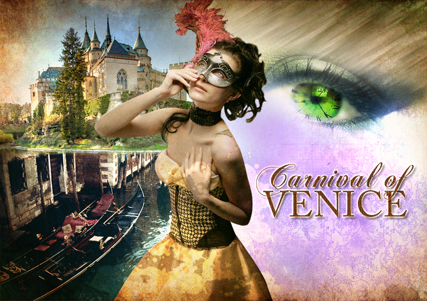
End of e-wallpaper tutorial.
PS: I hope my tutorial does makes sense.
Disclaimer: I do not own any of these pictures. These pictures are copyright of their respective owner. (I would link back to them, but I've forgotten where I found them. Therefore, credits goes to their owner).
Reference: http://www.eyesontutorials.com/articles/30/1/Constellations-Photo-Effects/Page1.html (I've improvised the tutorial to suit to my theme)
E-wallpaper tutorial Part 2
Here's the part 2:
1) Create a new canvas with the following setting: (I'm using 297 x 210 mm or 842 x 549 pixels with 72 resolution (A4 size) )

2) Drag the eye layer into the new canvas. Press Ctrl + T and rotate it slightly to the right. Place it at the right top corner of the canvas.

3) Open up the picture of this high grass

and by using the magic wand tool, delete the sky.

3) Press Ctrl + T and rotate it vertically. Place the grass above the eye layer.

4) Go to filter > Blur > Motion blur. Change the angle to 32 and distance to 57 pixles. Then click ok. Next, duplicate this layer by pressing Ctrl + J. Go to Filter > Blur > Gaussian Blur. Place this duplicated layer under the original grass layer to give a somewhat blur effect.

5) Open up the cloud image,

drag into the canvas containing the eye n grass. Remove the sky by using Magic wand tool and place it below the eye. Use the Blur tool the smoothen up the cloud edges. Duplicate this layer, go to Filter >Bblur > Gaussian Blur. Merge these cloud image together.
6) Duplicate the merge cloud image and place it along the eyes.

7) Open up this texture,

and place it above all of the layers. Change the layer type to Overlay. Use the eraser tool to earse the part covering the eye and grass, but leave the part covering the clouds. You will get something like this:

End of part 2.
E-wallpaper tutorial Part 1
Here's the part 1 of my e-wallpaper tutorial. This part will mainly shows how I changed the eyes to look fantasy like.
1) Open the eye image with photoshop.


4) Create new layer and apply the same step but this time, change the color to bright Red ( #ff0101) and change the layer type to Soft Light.


11) Hold shift > click onto all the layer > right click > merge layers.

End of part 1.
1) Open the eye image with photoshop.

2) Create new Layer, double click it and rename it as Green. Next, with the Green layer highlighted click on the brush tool and change brush color to bright green.
I used the #01ff0d color for this.
3) Change the brush opacity to 71% and flow to 51%. Color the eye with this green and change the layer type to Overlay.

4) Create new layer and apply the same step but this time, change the color to bright Red ( #ff0101) and change the layer type to Soft Light.

5) click onto the Eye layer and hide the Green and red layer by clicking the eye icon on the left of each layer. Go to Image > Adjustment > Selective Color. Choose the setting as below then click ok:


6) Re-click the eye icon on both green & red layers to make it visible.
7) Open this clock image and drag it into the eye image using the move tool.


8) Use the elliptical marquee tool and trace the clock face. Then right click > Select Inverse. Press Ctril + X to remove the outside of the clock.

9) press Ctrl + T and start to resize the clock face so that it is almost the same size as the eye.

10) Change the clock layer to Multiply. Using the eraser tool, earse the clock outside of the eye so that it will fit perfectly inside.

11) Hold shift > click onto all the layer > right click > merge layers.

End of part 1.
Opinions anyone?
So I have completed my e-wallpaper, but I couldn't decide which one is better. Can anyone give their opinion?


The first:

The second:

The first has a "transparent looking girl" beside the big eye, while the second one doesn't. I know there are no big differences, but I still want to know what you guys think.
Ps: Will be posting the tutorial tomorrow since it's kind of long and it's already midnight.
Tuesday, November 9, 2010
Photo Retouching
It took me around 20 minutes to understand a bit about photo retouching, but it was worth it. Somehow, with the help from Madam Lydia, I had managed to change this photo:

Into this:

With just this image, I had learned new techniques and understand a bit more about the tools in Photoshop. Some of the tools that I use in this photo are : Smudge, Sharpen, Dodge, Clone Stamp, Color Adjustment, Marquee & Polygonal Lasso.
Since my computer is having a bit of technical glitch, I will show you the tutorial for this photo retouching in my next post.
Saturday, November 6, 2010
Photo of my choice
Edited: I had planned to do a simple wallpaper at first, but since it looks kind of boring, I have changed my mind. Here are the photos which I will use for my wallpaper.


As you can see, the girl at the very top will be the main focus. While the rest of the photos will used for the background to decorate the empty space. I'm planning to do a vintage looking wallpaper since Carnival of Venice is one of the oldest carnival in the world. I wanted to show the "olden time" in my wallpaper, that's why I'm going to apply vintage in there.
Subscribe to:
Posts (Atom)